Introduction
Evaluating a machine learning model is essential to ensure it generalizes well—that is, it performs reliably on unseen data.
Testing simulates real-world conditions and helps decide whether a model is ready for deployment.
For binary classification tasks, several specialized methods can be used to measure performance.
Contents
This post reviews six key testing methods for binary classification, all available in Neural Designer:
Neural Designer implements all those testing methods.
Try Neural Designer to experiment with these methods yourself.
Testing data
To illustrate those testing methods for binary classification, we generate the following testing data.
| Instance | Target | Output |
|---|---|---|
| 1 | 1 | 0.99 |
| 2 | 1 | 0.85 |
| 3 | 1 | 0.70 |
| 4 | 1 | 0.60 |
| 5 | 0 | 0.55 |
| 6 | 1 | 0.54 |
| 7 | 0 | 0.53 |
| 8 | 1 | 0.52 |
| 9 | 0 | 0.51 |
| 10 | 1 | 0.49 |
| 11 | 1 | 0.41 |
| 12 | 0 | 0.40 |
| 13 | 0 | 0.28 |
| 14 | 0 | 0.27 |
| 15 | 0 | 0.26 |
| 16 | 0 | 0.25 |
| 17 | 0 | 0.24 |
| 18 | 0 | 0.23 |
| 19 | 0 | 0.20 |
| 20 | 0 | 0.10 |
The target column determines whether an instance is negative (0) or positive (1).
The output column is the model’s corresponding score, i.e., the probability that the corresponding instance is positive.
Confusion matrix
The confusion matrix is a visual aid to depict the performance of a binary classifier.
The first step is to select a decision threshold τ to classify instances as either positives or negatives.
If the probability assigned to the instance by the classifier is higher than &tau, it is labeled as positive; if it is lower, it is labeled as negative.
The default value for the decision threshold is τ = 0.5.
Once all the testing instances are classified, the output labels are compared against the target labels. This gives us four numbers:
| Predicted positive | Predicted negative | |
|---|---|---|
| Real positive | TP (positives correctly classified.) | FN (positives incorrectly classified as negatives.) |
| Real negative | FP (negatives incorrectly classified as positives.) | TN (negatives correctly classified.) |
As we can see, the rows represent the target classes, while the columns represent the output classes.
The diagonal cells show the number of correctly classified cases, and the off-diagonal cells show the misclassified instances.
This information is arranged in the confusion matrix as follows.
| Predicted positive | Predicted negative | |
|---|---|---|
| Real positive | 9 | 2 |
| Real negative | 2 | 8 |
In our example, let us choose a decision threshold τ = 0.5.
After labeling the outputs, the number of true positives is 9, the number of false positives is 2, the number of false negatives is 2, and the number of true negatives is 8.
As we can see, the model classifies most of the cases correctly.
However, we must conduct a more thorough testing analysis to fully understand its generalization capabilities.
Binary classification tests
The binary classification tests are parameters derived from the confusion matrix, which can help understand the information it provides. Some of the most crucial binary classification tests are the following:
Classification accuracy, which is the ratio of instances correctly classified, $$ classification\_accuracy = \frac{true\_positives+true\_negatives}{total\_instances} = 0.81$$
Error rate, which is the ratio of instances misclassified, $$ error\_rate = \frac{false\_positives+false\_negatives}{total\_instances} = 0.19$$
Sensitivity, which is the portion of actual positives that are predicted as positives, $$ sensitivity = \frac{true\_positives}{positive\_instances} = 0.818$$
Specificity, which is the portion of actual negatives predicted as negative, is calculated as follows: $$ specificity = \frac{true\_negatives}{negative\_instances} = 0.8$$
In our example, the accuracy is 0.81 (81%), and the error rate is 0.19 (19%), so the model can correctly label many instances. The sensitivity is 0.818 (81.8%), meaning the model can detect the positive instances. Finally, the specificity is 0.8 (80%), which shows that the model correctly labels most negative instances.
ROC curve
The receiver operating characteristic (ROC) curve is a key method for evaluating binary classifiers.
It summarizes performance by plotting the False Positive Rate (1–specificity) on the x-axis and the True Positive Rate (sensitivity) on the y-axis, across different decision thresholds.
A perfect classifier reaches the top-left corner (sensitivity = 1, specificity = 1).
The main metric is the area under the curve (AUC), where 1 indicates perfect performance.
The optimal decision threshold corresponds to the point closest to the top-left corner, as it balances sensitivity and specificity.
The following figure illustrates the ROC curve for our model.
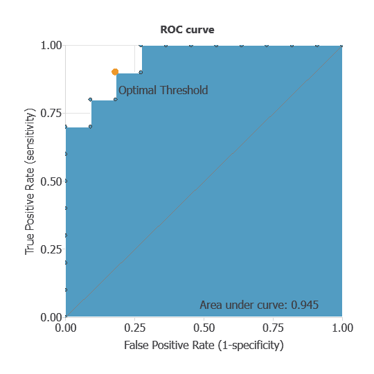
For our example, using a decision threshold of 0.5, area under the curve (AUC) is 1, which shows that our classifier performs well.
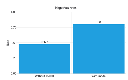
Positive and negative rates
Positive and negative rates measure the percentage of cases that perform the desired action.
In marketing applications, the positive rate is called the conversion rate, since it reflects the proportion of clients that respond positively to a campaign.
In our example, the first column of each chart represents the rates without using the model, while the second column shows the results obtained after applying the neural network.
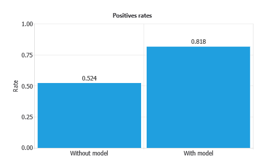
As depicted, the positive rate increases from 52.4% without the model to 0.818% with the model.
Similarly, the negative rate improves from 47.6% without the model to 0.8% with the model.
This indicates that the model achieves a perfect separation between positives and negatives, maximizing both conversion and rejection detection.
Cumulative gain
Cumulative gain charts evaluate classifier performance across data segments rather than the whole dataset.
They are especially useful in applications like marketing, where the aim is to capture the most positives with the fewest cases.
Each instance is assigned a probability score, so if the model ranks cases well, calling those with higher scores yields more positives than random selection.
In the chart, the grey line is a random classifier, the blue line is our model’s cumulative gain (above the baseline), and the red line is negative gain (below the baseline, as expected).
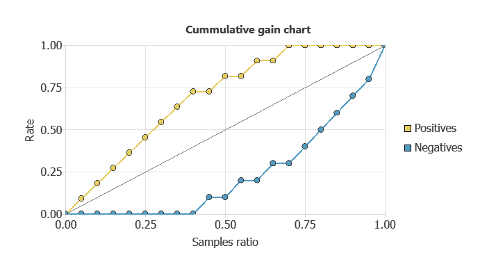
In this example, all positives are identified by analyzing only 60% of the highest-ranked cases.
From the curves, we can also compute the maximum gain score, the maximum distance between positive and negative gains, and the point of maximum gain.
Instances ratio | 0.75 |
|---|---|
| Maximum gain score | 1 |
As shown in the table, the maximum distance between both lines is reached by 75% of the population and takes the value of 1.
Lift chart
The information provided by lift charts is closely related to that provided by the cumulative gain.
It represents the actual lift for each population percentage, the ratio between positive instances found using and not using the model.
The lift chart for a random classifier is represented by a straight line joining the points (0,1) and (1,1).
The lift chart for the current model is constructed by plotting different population percentages on the x-axis against its corresponding actual lift on the y-axis.
If the lift chart keeps above the baseline, the model is better than randomness for every point. Back to our example, the lift chart is shown below.
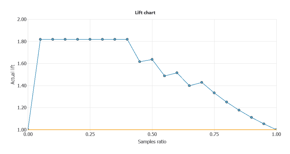
As shown, the lift curve always stays above the grey line, reaching its maximum value of 1.45 for the instance ratios of 0.1 and 0.2.
That means that the model multiplies the percentage of positives found by 2.5 for the 10% and 20% of the population.
Conclusions
Testing a model is critical for knowing a model’s performance.
This article has provided six different methods to test your binary models.
All these testing methods are available in the machine learning software Neural Designer.