
This tutorial explains the role of the dataset in building machine learning models.
A dataset is a table of rows and columns that provides the information to create a model.
A well-known example is the Iris flower data set, introduced by Ronald Fisher in 1936.
We can identify the next concepts in a dataset:

1. Data source
The data is usually stored in a data file. Some common data sources are the following:
|
From all that, the most used format for a data set is a CSV file. When possible, export your spreadsheet file, SQL query, etc., to CSV.
2. Variables
The variables are the columns in the data table. Variables might represent physical measurements (temperature, velocity,…), personal characteristics (gender, age,…), marketing dimensions (recency, frequency, monetary, etc.), etc.
Regarding their use, we can talk about:
Input variables
Input variables are the independent variables in the model. They are also called features or attributes.
Input variables can be continuous, binary, or categorical.
Target variables
Target variables are the dependent variables in the model.
In regression problems, targets are continuous variables (power consumption, product quality…).
On the other hand, in classification problems, targets are binary (fault, churn…) or categorical (the type of object, activity…). In this type of application, targets are also called categories or labels.
Unused variables
Unused variables are neither inputs nor targets. We can set a variable to Unused when it does not provide any information to the model (ID number, address, etc.).
Constant variables are those columns in the data matrix that always have the same value. They should be set as Unused since they do not provide any information to the model but increase its complexity.
3. Samples
Samples are the rows in the data table. They are also called instances or points.
Designing a neural network to memorize a set of data is not helpful. Instead, we want the neural network to perform accurately on new data and generalize.
To achieve that, we divide the data set into different subsets:
Training samples
During model design, we usually need to try different settings. For instance, we can build several models with different architectures and compare their performance. To construct all these models, we use the training samples.
Selection samples
Selection samples are used for choosing the neural network with the best generalization properties. In this way, we construct different models with the training subset and select the one that works best on the selected subset.
Testing samples
Testing samples are used to validate the functioning of the model. We train multiple models using the training samples, then select the one that performs best on these samples and test its capabilities with the testing samples.
Unused samples
Some samples might distort the model instead of providing helpful information to the model. For example, outliers in the data can make the neural network work inefficiently. To fix these problems, we can set those samples to Unused.
The standard is to use 60% of the samples for training, 20% for selection, and 20% for testing. Splitting of the samples might be performed in sequential order or randomly.
We can also set repeated samples to Unused since they provide redundant information to the model.
2.4. Missing values
A data set can also contain missing values and elements that are absent.
Usually, missing values are denoted by a label in the data set. Some standard labels for missing values are NA (not available), NaN (not a number), Unknown, or ?. Avoid using numeric values like -999, as they may be confused with actual values.
There are two ways to deal with missing values:
Missing values unusing
If the number of samples in the data set is significant and the number of missing values is small, we can exclude those samples with missing values from the analysis.
This way, the unusing method sets those samples with missing values to Unuse.
Missing values imputation
If the data set is small or the number of missing values is significant, you probably cannot afford to exclude the samples with missing values. In these cases, assigning probable values to the missing data is advisable.
The most common imputation method is substituting the missing values with the mean value of the corresponding variable.
2.5 Data set tasks
Some of the essential techniques for data analysis and preparation are the following:
- Statistics.
- Distributions.
- Box plots.
- Time series plots.
- Scatter charts.
- Inputs correlations.
- Inputs-targets correlations.
- Outliers.
- Filtering.
- Uncorrelated variables unusing.
Statistics
Basic statistics are valuable information when designing a model, as they can alert to the presence of spurious data. It is necessary to check the correctness of every variable’s most critical statistical measures.
As an example, the following table depicts the minimum, maximum, mean, and standard deviation of the variables used to improve the performance of a combined cycle power plant.
| Minimum | Maximum | Mean | Standard deviation | |
|---|---|---|---|---|
| temperature | 1.81 | 37.11 | 19.65 | 7.45 |
| exhaustt_vacuum | 25.36 | 81.56 | 54.31 | 12.71 |
| ambient_pressure | 992.89 | 1033.30 | 1013.26 | 5.94 |
| relative_humidity | 25.56 | 100.16 | 73.31 | 14.60 |
| energy_output | 420.26 | 495.76 | 454.37 | 17.07 |
In classification applications, comparing the statistics for each category is also interesting. For instance, we can compare the mean age of customers who buy a particular product with that of those who do not.
Distributions
Distributions show how the data is distributed over its entire range. If the data is irregularly distributed, the resulting model will probably be of poor quality.
Histograms are used to see how continuous variables are distributed. Continuous variables usually have a normal (or Gaussian) distribution.
For example, the following figure depicts a histogram of the noise generated by different airfoil blades.
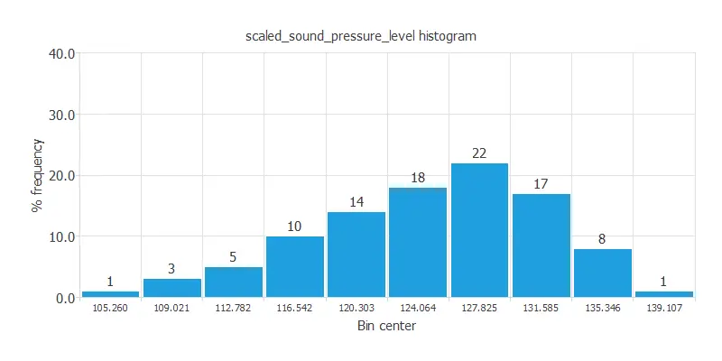
As we can see, this variable has a normal distribution. 22% of the airfoil blades in the data set emit a sound around 127 dB.
Pie charts are used to see the distribution of binary or nominal variables. This type of variable should be uniformly distributed.
The following figure shows the pie chart for the customers of a bank who purchased a bank deposit in a marketing campaign, which is a binary variable.
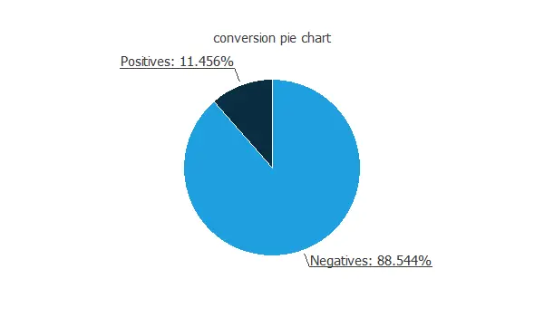
Approximately 88.5% of the customers do not purchase the product, and 11.5% purchase it. Therefore, this variable is not well-balanced, indicating a higher number of negatives than positives.
Box plots
Box plots also provide information about the shape of the data. They display information about every variable’s minimum, maximum, first quartile, second quartile (or median), and third quartile. They consist of two parts: a box and two whiskers.
The length of the box represents the interquartile range (IQR), which is the distance between the third quartile and the first quartile. The middle half of the data falls inside the interquartile range. The whisker below the box shows the minimum of the variable. On the other hand, the whisker above the box shows the variable’s maximum.
Within the box, we also draw a line representing the variable’s median.
The following figure illustrates the box plot for the age of the employees of a company.
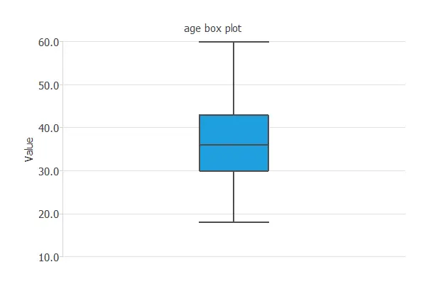
As we can see, 50% of the customers are between 35 and 45 years old.
Time series plots
It is helpful to see how the different variables evolve in forecasting applications. In this way, time series plots display observations on the y-axis against time on the x-axis.
The following figure is an example of a time series plot. It depicts the temperature in a city over the years.
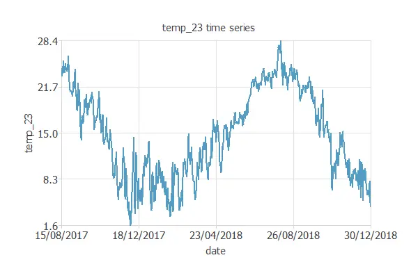
The figure above shows a cyclic variable. It also shows some outliers in the data (wrong temperature observations).
Scatter charts
It is always beneficial to see how the targets depend on the inputs. Scatter charts show points with target values versus input values.
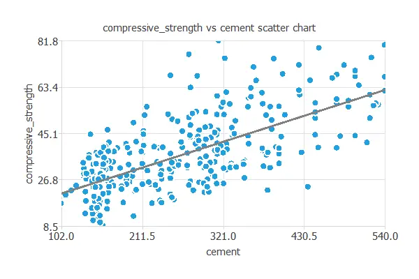
For example, the following chart shows concrete’s compressive strength as a function of cement quantity.
As we can see, there is quite a strong correlation between both variables: the greater the quantity of cement, the greater the compressive strength.
Inputs correlations
Sometimes, data sets contain redundant data that complicates the design of the neural network. To discover redundancies between the input variables, we use a correlation matrix.
The correlation is a numerical value between -1 and 1 that expresses the strength of the relationship between two variables. When it is close to 1, it indicates a positive relationship (one variable increases when the other increases); a value close to 0 indicates no relationship; a value close to -1 indicates a negative relationship (one variable decreases when the other decreases).
We calculate the correlation using a linear function when both variables are continuous. When one or both variables are binary, we calculate the correlation using a logistic function.
Next, we depict the correlations among the features used to target donors in a blood donation campaign. This example uses a recency, frequency, monetary, and time (RFMT) marketing model.
| Recency | Frequency | Quantity | Time | |
|---|---|---|---|---|
| Recency | 1.00 | -0.18 | -0.18 | 0.16 |
| Frequency | 1.00 | 1.00 | 0.63 | |
| Quantity | 1.00 | 0.63 | ||
| Time | 1.0 |
In this case, the quantity variable perfectly correlates with the frequency variable (1.00). That means we can remove one of those variables in our model without losing information.
Inputs-targets correlations
It is beneficial to know the dependencies of the target variables on the input variables. For this kind of diagnostic analytics, we also use correlation coefficients. If the correlation is 0, they are independent of each other. Increasing or decreasing one does not imply that it increases or decreases another. On the other hand, if the correlation coefficient is 1 or -1, they are directly or inversely dependent.
We use linear correlations when both the input and the target are continuous. We use logistic correlations when one or both the input and the target are binary.
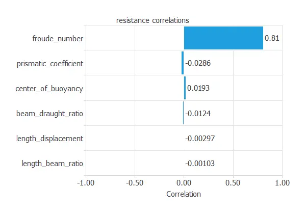
The following figure shows the correlations between the dimensions and velocity of a sailing yacht and its corresponding hydrodynamic performance.
The above figure shows a variable with a high correlation (more than 0.5) and about ten variables with a small correlation (less than 0.1).
Autocorrelations
In forecasting applications, autocorrelations refer to the correlations of a time series with its past values.
We call a positive autocorrelated time series persistent because positive deviations from the mean follow positive deviations from the mean. Conversely, negative deviations from the mean follow negative deviations from the mean.
On the other hand, negative autocorrelated time series are characterized by a tendency for positive deviations from the mean to be followed by negative deviations from the mean and vice versa.
The following figure shows an example of an autocorrelation chart. It depicts the correlations among meteorological variables from the past five days.
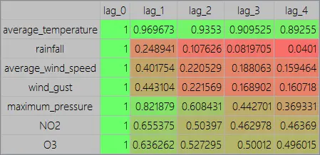
As we can see, the highest autocorrelated variable is the temperature, and the lowest autocorrelated variable is the rainfall.
Cross-correlations
In forecasting applications, cross-correlation charts show the correlation between a target variable and the lags of an input variable.
As an illustration, the following figure shows the correlations between the rainfall of today and the maximum pressure of yesterday, the day before yesterday, etc.
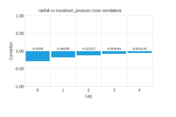
The chart above shows negative and decreasing correlations.
Outliers
An outlier is a sample that is distant from other samples. They may be due to variability in the measurement or may indicate experimental errors.
If possible, we should exclude outliers from the data set, setting the sample as Unused. However, detecting those anomalous samples might be difficult and requires much work.
The first thing we can do is check the correctness of the data statistics. Indeed, spurious minimums and maximums clearly indicate the presence of outliers.
We can also plot the data histograms and check that no isolated bins are at the ends.
Box plots are also suitable for detecting the presence of outliers since they depict data groups through their quartiles.
In this regard, Tukey’s method defines outliers as values too far from the median.
The cleaning parameter sets the maximum allowed distance: larger values make the test less sensitive, while smaller ones flag more outliers.
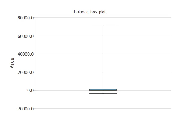
For example, the following chart is a box plot of the balance of a bank’s customers. As we can see, a few clients have a very high balance, and we can treat them as outliers.
Other methods for dealing with outliers include the Minkowski error.
For more information, you can read the 3 methods to deal with outliers posted on our blog.
Filtering
Filtering aims to reduce the noise or errors in the data.
Here, the samples that do not fall in a specified range are unused.
When filtering data, the minimum and maximum allowed values for all the variables must be set.
Uncorrelated variables unusing
Unusing uncorrelated variables allows for reducing the problem dimensions without much loss of information.
Neural Network ⇒