6. Testing analysis
The purpose of testing is to compare the outputs from the neural network against targets in an independent set (the testing instances). The available testing methods depend on the project type: approximation, classification or forecasting.
The neural network can move to the so-called deployment phase if all the testing metrics are considered okay. Note also that testing results depend very much on the problem, and some numbers might be correct for one application but wrong for another.
The validation methods that need to be used depending on the application type:

Approximation testing methods
The most used testing methods in approximation applications are the following:
Testing errors
Testing errors compare the targets and outputs from the neural network for the training, validation and testing samples.
For approximation models, Neural Designer reports:
- Mean squared error.
- Normalized squared error.
- Minkowski error.
Forecasting models also report the sum squared and root mean squared errors.
These metrics complement the loss indices used during training.
All testing values are measured on the testing samples of the data set.
Errors statistics
Errors statistics measure the minimums, maximums, means, and standard deviations of the errors between the neural network and the testing instances in the data set.
The following table contains the basic statistics on the absolute, relative, and percentage error data when predicting the price of a car using machine learning.
| Minimum | Maximum | Mean | Deviation | |
|---|---|---|---|---|
| Absolute error | 17.39 | 13236.5 | 2108.62 | 2615.68 |
| Relative error | 0.00043 | 0.3285 | 0.0523 | 0.0649 |
| Percentage error | 0.043% | 32.85% | 5.23% | 6.49% |
The above table allows the user to visualize how well his model predicts the data by comparing the test data with our neural network model.
Errors histogram
Error histograms show how the errors from the neural network on the testing instances are distributed. The histogram indicates how predicted values differ from the target values. Hence, these can be negative.
Generally, a normal distribution centered at 0 for each output variable is expected here.
The following figure illustrates the histogram of errors made by a neural network when predicting sailing yachts’ residuary resistance. Here, the number of bins is 10.
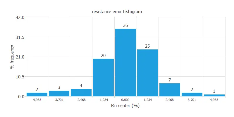
In this type of histogram, we group the data in bins and examine the error of each bin. With Neural Designer, you can choose the number of bins in your histogram.
The X-axis represents the number of bins, in other words, the number of divisions in the test samples.
The Y-axis represents the number of samples (as a percentage) from your dataset in a particular bin.
Maximal errors
It is beneficial to see which testing instances provide the maximum errors and alerts for deficiencies in the model.
The following table illustrates a neural network’s maximal errors for modeling nanoparticles’ adhesive strength.
| Rank | Index | Error | Data |
|---|---|---|---|
| 1 | 30 | 9.146 | shear_rate: 75 particle_diameter: 4.89 particles_adhering: 42.43 |
| 2 | 35 | 9.121 | shear_rate: 75 particle_diameter: 6.59 particles_adhering: 35.77 |
| 3 | 11 | 6.851 | shear_rate: 50 particle_diameter: 4.89 particles_adhering: 52.76 |
In this case, the particles with a shear rate of 75 yields the most significant error.
It indicates which properties have a more significant error and, therefore, do not fit our neural network model as well. It may be desirable to clean the data or remove the features that generate a significant error from the data entry.
Perform goodness-of-fit analysis
The goodness-of-fit analysis is a method to test the performance of a model in approximation applications; it describes how well it fits a set of observations.
Goodness-of-fit measures typically summarize the discrepancy between observed values and the values expected under the model in question.
This analysis leads to the coefficient of determination, R2. This coefficient quantifies the proportion of variation of the predicted variable from the actual values. If we had a perfect fit, this coefficient would take the value of 1; then there is a perfect correlation between the outputs from the neural network and the targets in the testing subset.
The following figure plots the goodness-of-fit analysis for predicting the noise generated by airfoil blades. As we can see, all the predicted values are very similar to the real ones.
The chart of goodness-of-fit is the grey line that forces the y-intercept to 0 to get the best prediction results (outputs equal to targets). The blue dots are the test values.
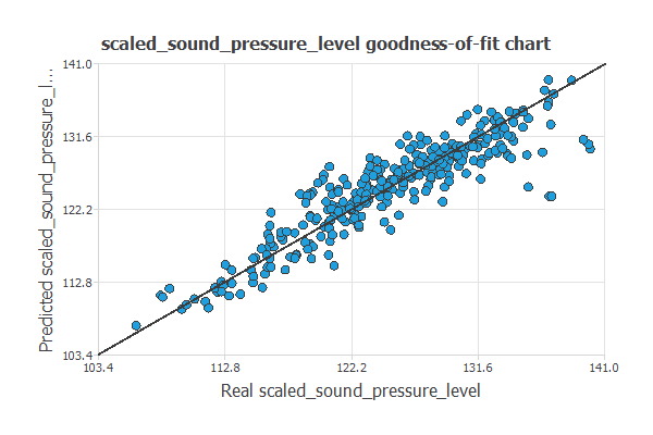
For this example, the goodness-of-fit gives us the coefficient of determination R2, which equals 0.82. This is an excellent value for this coefficient, and we can see a good correlation between the neural network model and the targets in the testing subset.
Classification testing methods
The most common testing methods in classification applications are the following:
- Classification errors.
- Confusion matrix.
- Binary classification tests.
- Multiple classification tests.
- ROC curve.
- Cumulative gain.
- Lift chart.
- Positives and negatives rates.
- Profit chart.
- Misclassified instances.
Classification errors
Classification errors measure the difference between the target classes and the probabilities produced by the model.
Depending on the model, Neural Designer reports sum squared, mean squared, root mean squared, normalized squared and cross-entropy errors.
Confusion matrix
In the confusion matrix, the rows represent the target classes in the data set, and the columns with the corresponding output classes from the neural network.
The diagonal cells in each table show the number of correctly classified cases, and the off-diagonal cells show the misclassified cases.
Positive means are identified for binary classification, and negative means are rejected. Therefore, four different cases are possible:
- True positive (TP): correctly identified.
- False positive (FP): incorrectly identified.
- True negative (TN): rightly rejected.
- False negative (FN): wrongly rejected.
Note that the output from the neural network is generally a probability. Therefore, the decision threshold determines the classification. The default decision threshold is 0.5. An output above the threshold is classified as positive, and an output below it is classified as negative.
For the case of two classes, the confusion matrix takes the following form:
| Predicted positive | Predicted negative | |
|---|---|---|
| Real positive | true_positives | false_negatives |
| Real negative | false_positives | true_negatives |
The following example is the confusion matrix for a neural network that assesses the risk of credit card clients’ default.
| Predicted positive | Predicted negative | |
|---|---|---|
| Real positive | 745 (12.4%) | 535 (8.92%) |
| Real negative | 893 (14.9%) | 3287 (63.8%) |
For multiple classification, the confusion matrix can be represented as follows:
| Predicted class 1 | ··· | Predicted class N | |
|---|---|---|---|
| Real class 1 | # | # | # |
| ··· | # | # | # |
| Real class N | # | # | # |
The following example is the confusion matrix for the classification of iris flowers from sepal and petal dimensions.
| Predicted setosa | Predicted versicolor | Predicted virginica | |
|---|---|---|---|
| Real setosa | 10 (33.3%) | 0 | 0 |
| Real versicolor | 0 | 11 (36.7%) | 0 |
| Real virginica | 0 | 1 (3.33%) | 8 (26.7%) |
As we can see, all testing instances are correctly classified except one, which is an iris Virginica that has been ranked as an iris Versicolor.
Binary classification tests
Binary classification tests are calculated from the confusion matrix for the selected decision threshold.
- Classification accuracy: proportion of correctly classified samples.
- Error rate: proportion of misclassified samples.
- Sensitivity: proportion of real positives predicted as positive.
- Specificity: proportion of real negatives predicted as negative.
- Precision: proportion of predicted positives that are real positives.
- Positive likelihood: ratio between the true positive and false positive rates.
- Negative likelihood: ratio between the false negative and true negative rates.
- F1 score: harmonic mean of precision and sensitivity.
- False positive rate: proportion of real negatives predicted as positive.
- False discovery rate: proportion of predicted positives that are false.
- False negative rate: proportion of real positives predicted as negative.
- Negative predictive value: proportion of predicted negatives that are real negatives.
- Matthews correlation: correlation between the real and predicted classes.
- Youden’s index: combined measure of sensitivity and specificity.
- Markedness: combined measure of positive and negative predictive values.
These metrics can be used together when assessing the risk of credit card clients’ default and in other binary classification applications.
Multiple classification tests
For problems with more than two classes, Neural Designer calculates precision, recall and F1 score for every class.
It also reports the macro average, where all classes have the same weight, and the weighted average, which accounts for the number of samples in every class.
ROC curve
A standard method for testing a neural network in binary classification applications is to plot an ROC (Receiver Operating Characteristic) curve.
The ROC curve plots the false positive rate (or 1 – specificity) on the X-axis and the true positive rate (or sensitivity) on the Y-axis for different decision thresholds.
An example of the ROC curve for diagnosing breast cancer from fine-needle aspirate images is the following.
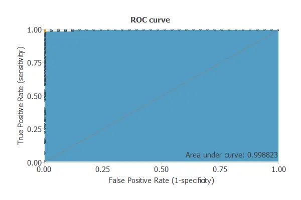
The capacity of discrimination is measured by calculating the area under the curve (AUC). A random classifier would give AUC = 0.5, and a perfect classifier AUC = 1.
For the above example, the area under the curve is AUC = 0.994. That is an excellent value, indicating that the model predicts almost perfectly.
Cumulative gain
The cumulative gain analysis is a visual aid that shows the advantage of using a predictive model instead of randomness.
It consists of two lines:
- The baseline represents the results that would be obtained without using a model.
- The positive cumulative gain shows in the y-axis the percentage of positive instances found against the percentage of the population, represented in the x-axis.
- The negative cumulative gain shows the percentage of the negative instances found against the percentage of the population.
The following chart shows the analysis results for a model that predicts if a bank client is likely to churn. The blue line represents the positive cumulative gain, the red line represents the negative cumulative gain, and the grey line represents the cumulative gain for a random classifier.
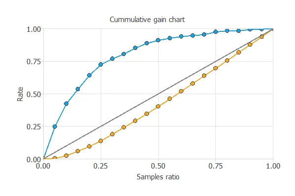
In this case, by using the model, we see that by analyzing the 50% of the clients with the higher probability of churn, we would reach 80% of clients going to leave the bank.
Lift chart
This method provides a visual aid to evaluate a predictive model loss. It consists of a lift curve and a baseline. The lift curve represents the ratio between the positive events using a model and without using it. The baseline represents randomness, i.e., not using a model.
The x-axis displays the percentage of instances studied. The y-axis shows the ratio between the results predicted by the model and the results without the model. Below is depicted the lift chart of a model that indicates if a person will donate blood.
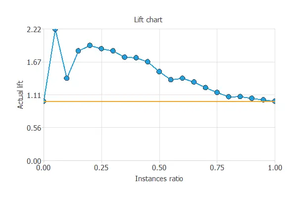
To explain the usefulness of this chart, let us suppose that we are trying to find the positive instances of a data set. If we try to find them randomly after studying 50% of the instances, we discover 50% of the positive instances.
Now, let’s suppose that we first study those instances that are more likely to be positive according to the score that they have received from the classifier. After studying 50% of them, we found 80% positive instances.
Therefore, by using the model, after analyzing 50% of the instances, we would discover 1.6% more positive instances than by looking for them randomly. This advantage is what is represented in the lift chart.
Positives and negatives rates
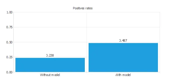
Positive rates tell us how the selection of positives changes by using a classification model.
In marketing applications, the positive rate is called the conversion rate. Indeed, it depicts the number of clients responding positively to our campaign instead of the number of contracted clients.
The following chart shows two rates. The first column represents the data set rates, while the second one represents the ratios for the predicted positives of the model.
Profit chart
This testing method shows the difference in profits from randomness and those using the model depending on the instance ratio.
In this chart, three lines are represented. The grey one means the profits from randomly choosing the instances. The blue line is the evolution of the profits when using the model. Finally, the black one separates the benefits from the losses of the process. The chart below represents the profit chart of a model that detects forged banknotes.
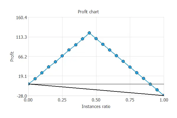
The values of the previous plot are displayed below.
- Unitary cost: 1
- Unitary income: 2
- Maximum profit: 122.7
- Instance ratio: 0.45
The maximum profit is the value of the most significant benefit obtained with the model, 122.7%, and the instance ratio is the percentage of instances used to get that benefit, 45%.
Misclassified instances
When performing a classification problem, knowing which instances have been misclassified is essential. This method shows which actual positive instances are predicted as unfavorable (false negatives) and which actual negative instances are predicted as positive (false positives).
This information is displayed in a table format, identifying each instance with an Instance ID, and showing its corresponding data, composed of its values of the model variables. Two tables are displayed, one for the positive instances predicted as negative and the other for the negative instances predicted as positive.
To learn more about testing analysis, you can read the 6 testing methods for binary classification article in our blog.
Forecasting testing methods
All testing methods used for approximation models are also valid for forecasting models.
Forecasting models additionally provide an outputs plot:
Outputs plot
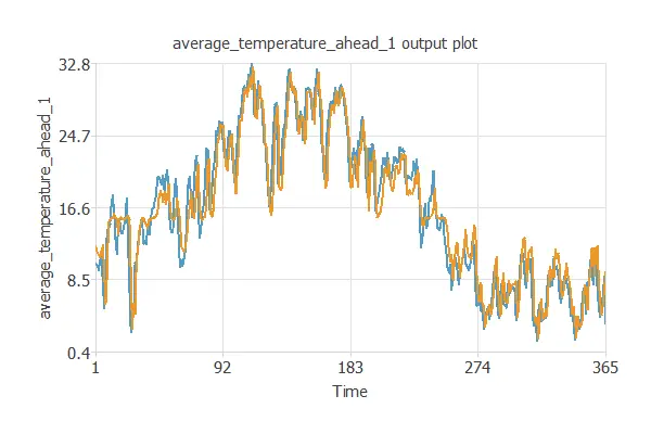
This chart plots the time series targets and their corresponding predictions against time.
The next chart shows the one-step-ahead average temperature in a city (blue) and the corresponding predictions (orange).